Less is More
Reproduced. See bottom.
In a previous TAE article I mentioned that it is best to take a 'less is more' approach when exhibiting artwork at a physical location. I suggested that displaying too much artwork at once can become a 'blur' of visual information that distracts viewers. In other words, gallery visitors will have a difficult time 'locking in' on each piece if too much is offered -- they will be overwhelmed by the visual bombardment placed before them. The same tip can be applied to an artist website. You don't want to overwhelm your website visitors. Less is more!
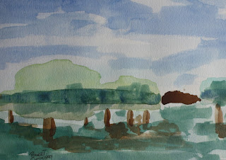
Abstract landscape, w/c. R Cummiskey.
In a previous TAE article I mentioned that it is best to take a 'less is more' approach when exhibiting artwork at a physical location. I suggested that displaying too much artwork at once can become a 'blur' of visual information that distracts viewers. In other words, gallery visitors will have a difficult time 'locking in' on each piece if too much is offered -- they will be overwhelmed by the visual bombardment placed before them. The same tip can be applied to an artist website. You don't want to overwhelm your website visitors. Less is more!
I view thousands of artist websites each week. It is common for me to discover artist websites that are packed with hundreds of art images. This approach is unnecessary in my opinion. In fact, this image hoarding, if you will, can be troublesome for a number of reasons -- I've listed a few below:
1.) The average artist website visitor is NOT going to look at hundreds of art images individually. He or she will likely feel overwhelmed if the artist website features page after page of images. The average website visitor does not want to spend a great length of time sifting through images. The image bombardment -- in this context -- is counterproductive. Hopefully he or she will discover the real gems before jumping ship. Hopefully...
2.) It often appears as though the artist has posted images of everything that he or she has created just for the sake of having said images displayed online. The downside of this behavior is that the best work tends to end up being 'swallowed' by images that are simply not of the same caliber. Point-blank, there is no need to upload images of notebook doodles or vacation sketches unless those directions happen to be your concentration.
3.) It is common to see images that are extremely outdated compared to the level of work the artist is capable of creating today. The artist website visitor is probably not going to be interested in viewing page after page of work created decades ago. In other words, you don't need to upload image after image of artwork created during your junior high years. Those images are no longer relevant to your current art practice.
The problems listed above can be a burden for both the artist and viewer. Unfortunately, I often stumble upon these situations when viewing art online. In this context you want the viewer to focus on specific images... NOT on how productive you've been. It pays to be tactful when displaying images of your artwork online... focus on the 'best of the best' of what you do - the rest will follow. Less is more.
Remember the 'less is more' approach when displaying art images on your artist website. You don't need hundreds of images to present yourself effectively to potential art buyers and other art lovers. Think of traditional art portfolios -- 'old school' art portfolios did not contain 200+ examples. With that in mind, I think it is best to focus on 10 to 20 images at any given time. Furthermore, I would suggest following an image rotation schedule -- adding and removing images in order to keep your artist website fresh.
In closing, I want to know what YOU think about this artist website tip. Do you agree with me? Do you disagree? What do you think about the 'less is more' approach in this context? Click here to comment on this article.
Take care, Stay true
Brian Sherwin


Comments
Post a Comment